Friday, October 27, 2017

What I'm Not Buying: Urban Decay Heavy Metals Palette


For the holiday season, Urban Decay has released the Heavy Metals palette, an all-shimmer palette with a supposed new formula. 

And I won't be buying. 

What's interesting to me is that I have heard a lot of talk about this palette, but conversations are usually about the packaging. The palette itself is entirely reflective, and there is a mirror between the two sides of the palette. My favorite complaint about the packaging thus far is that it is not good for beauty vloggers because it is so reflective and therefore difficult to show on camera. I have heard this from a few different people, and maybe that's a comment that's useful to other vloggers or bloggers (I can imagine photographing this would be a nightmare), but for consumers at large, that kind of critique is not really all that useful. It was a nice reminder to me, however, that sometimes these reviewers can be a little out of touch with the needs and desires of their main audience. That's important to keep in mind, I think, because so often these reviewers will say that you "need" something or "Go out right now and buy it, you won't be disappointed!" which is so easy to say when you receive PR or make some kind of your income off of buying and reviewing products. (Those purchases can then be written off of taxes.) But the vast majority of people don't need most products that are released, and they certainly don't need to consider how well packaging will hold up on camera. 

I'll be honest and say that I don't particularly have any interest in this palette. I've mentioned before that I don't have a ton of interest in all-shimmer palettes, because I cannot make much of a look with only shimmers. My personal preference for makeup is to have a shimmery shadow on the lid and then build the rest of the look with matte shades, so a palette with only shimmers would not get a ton of use. I would prefer to buy shimmery singles for this purpose than have an entire palette. 

I've mentioned this before, but I am also not a fan of Urban Decay palettes. I've read that this is a new formula, so there is a chance that I would like it, but I'm not so interested to explore the new formula that I want to buy an entire palette. I also feel like "trying a new formula" is just an excuse that a lot of people make to justify buying things they don't need. If they already have those colors in their collection and know they really shouldn't buy it but want to give into the hype, they will say that they want to explore the new formula. But if you already have products that work well and that you enjoy, spending that kind of money "just to try it" is just a justification for hype. 

I also don't like the packaging of this palette. The palette comes in a purple plastic container with a scrunched end:


Personally, I am not a huge fan of the scrunched end, and I can imagine that it makes stacking and storing this palette a bit challenging. The main part of the palette lifts out:


And I suppose the layout is inspired by an artist's palette for paint. I'm not typically a fan of packaging where the product removes itself entirely from the protective case as I find it to create extra hassle for no apparent reason. I also don't really like the layout of shadows and don't like the mirror between the two sides. It seems like it would be awkward to lift the entire palette to look at yourself in the mirror, and it doesn't seem like it would be very functional—I can imagine it would be difficult to hold and apply makeup at the same time. 

In terms of colors, this isn't something that we haven't seen before. The right side of the palette looks like so many warm-toned palettes, and looks really similar to the Make Up For Ever holiday 2017 palette:


From Urban Decay itself, Heavy Metals reminds me of After Dark:


As well as Vice 3:


And Vice 4:


It also looks like Tarte Make Believe in Yourself:


And for a brighter option, there's Juvia's Place Masquerade:


From my own collection, it looks like Viseart Bijoux Royale:


Makeup preferences certainly change over time, and there was a point in my life where I would have snatched this palette in a heartbeat and would not have considered the cons of packaging, practicality, and personal preference. I am definitely in my "favorite" stage of makeup preferences right now and really enjoy all the products that I have and equally enjoy being picky with what I choose to purchase. And there is just nothing so special about the Heavy Metals palette that I feel is worth being picky. There are so many shimmery, foiled palettes and singles within this color scheme, and it's funny to me how much this palette looks like After Dark. Brands notoriously recycle old colors and color schemes, but when a brand recycles their own products (After Dark released last year around the holidays), it gets to be a little ridiculous. 

In terms of positives, the colors certainly are pretty, and it seems as though this palette has received positive reviews in terms of performance, so maybe the new formula really is a step above what they have previously produced. But, again, trying a new formula is just not a good enough reason for me to buy colors that I already have. And since this palette looks so similar to several other Urban Decay palettes, people who are fans of the brand will likely have all of these colors in abundance as well. And I suppose that they are banking on people being so curious to try the new formula that they won't mind buying something again. 

I also appreciate that this palette contains warm tones as well as cool/colorful tones, but, again, this really feels like a companion palette to me. That is not to say that someone can't create an all-shimmer look; in fact, one of my all-time favorite looks I've done was a shimmery chrome on the lid and a shimmery olive in the crease. I've also been really into a shimmery brow bone highlight recently, so I can certainly see people doing an all-shimmery look. But I would also say that for most people, the majority of looks aren't completely shimmery. I don't personally subscribe to the notion that a palette must possess "complete" looks in order to be worth purchasing, because I feel like that way of thinking tends to result in having multiples upon multiples of the same colors in one's collection. But, $55 is also a lot of money to spend on a palette where only one or two shadows would be used at a time. For most people, I would guess that they are truly attracted to only a handful of colors in this palette, and those are probably shadows that they already own, or they are colors that can be purchased as singles. 

While I think this palette generally has a nice color scheme, it is also something that I have seen many times over and definitely already own. The impracticality of the packaging just adds another negative onto this product to really seal the deal for me that this is not a product that would get a ton of use in my collection. I think it's exciting that Urban Decay has reformulated their shadows, and I'm excited to see what else they come up with—hopefully something that sets a new trend instead of follows something a little old. I don't have any use for this palette, so I won't be buying. 

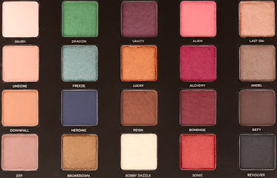
Saturday, October 21, 2017

Weekly Looks: Kat Von D Mi Vida Loca Remix and Desert Dusk


So, uh, there is a new palette in my life that is not a new palette at all, which is Kat Von D Mi Vida Loca Remix (!!). I honestly could not be more thrilled to own it, but I'll talk about that toward the end of the post. I traveled again this week and will be traveling for about a month, so these weekly and weekend looks posts may be disrupted. This week, I was only able to get three looks done, but I figured they were still worth sharing. 

Here are three looks I did this week. 

Look 1: Colourpop Glass Bull and "Desert Dusk"


Colourpop Glass Bull on the lid, Inglot peach and purple shades blended into the crease as transition shades, Coloured Raine Ladyship blended into the crease, and Fyrinnae Octopus (pressed) padded onto the outer corner and on the lower lash line. Too Faced Satin Sheets on the brow bone. Makeup Geek Phantom on the inner corner. 

Look 2: Kat Von D Mi Vida Loca Remix 


Destroyer on the inner and outer lid, Harpsichord on the center lid, Swoon blended into the crease as a transition shade, Destroyer blended into the crease, and Rewind padded onto the outer corner and blended into the crease and on the lower lash line. Legend lightly padded on top of Harpsichord. Fran and Legend in the inner corner. Skulls on the brow bone. 

Look 3: Kat Von D Mi Vida Loca Remix


NYX Milk as a base over the mobile part of the lid and inner corner, Synth on the lid, Swoon blended into the crease as a transition shade, Swoon and Destroyer blended into the crease, Analogue blended above Soon and Destroyer, Fran blended above Analogue, and Rewind blended above Synth to deepen the crease. Echo on the lower lash line. Lyric on the inner corner. Moulder on the brow bone. 


Look 1: Colourpop Glass Bull and "Desert Dusk"

I am still really enjoying this dupe palette I made of Huda Beauty Desert Dusk, and it is one of the few palettes I chose to travel with for this long stretch of time. That has traditionally been a gauge for me in terms of if I like or dislike a palette: if I'm excited to use a sole palette for two weeks or more, that's certainly a keeper; if I'm dreading it, that means I should probably return (if new) or declutter. Now, if I'm being totally honest, I don't think I would have felt as jazzed to take the actual Desert Dusk palette on such a long trip, but I really do love my duped (and then some) palette as a collection of some of my favorite singles. 

With this look, I had been really itching to try out Colourpop Glass Bull, and I have to say that I wasn't too thrilled with it. And that is surprising because so many people have been raving about it. I applied it over NYX Glitter Primer, and on me, it looked just like a brown-gold. It didn't have any of its neat duochrome or blue shift. But that also could be because of the shadows I paired with it. I feel like pairing it with the deep berry shades of Coloured Raine Ladyship and Fyrinnae Octopus totally drowned out Glass Bull. Next time, I think I would like to pair it with some lighter browns. On first impression, though, I was disappointed by how much of it was lost in this look. 

Kat Von D Mi Vida Loca Remix

I feel a couple different ways about talking about this palette. A big part of me wants to squee and gush because I am so, so thrilled to own this and have not been excited about a pre-made palette this much in a long time. I'm still over the moon with my Just Peachy Matte duped palette, but in terms of an actual palette produced by a brand, I can't think of another one I feel this struck by. At the same time, this was a limited edition product from two years ago that many people have expressed regret in not purchasing, and I would say that it is a "coveted" makeup item. And I don't want to gush about a product that is challenging, to say the least, to get a hold of. 

I bought this palette, and though it was pre-owned, it was never used. I wrote about this palette recently in my Kat Von D Saint and Sinner anti-haul post, and I said that while I don't really have "makeup regrets," this was a palette that I would have liked to own. I thought about buying it when it released because it was the hot new item, but at the time, I did not touch color with a ten-foot pole. I remember all of the tutorials on this palette at the time were something like, "How to make Mi Vida Loca Remix wearable," and I remember thinking that if I had to try and make it wearable, it wasn't the right product for me. 

Looking back on it, that was absolutely the right decision. And I am proud of myself for making the decision that I did because that was a time when my makeup spending was at an all-time high. I was buying makeup to get through the day and through my graduate program, and I certainly wasn't thinking about why I was buying things or really evaluating their worth in my collection. I'm surprised, frankly, that I didn't buy Mi Vida Loca Remix due to my state of mind at the time, but if I had, I know I would have absolutely decluttered it by now. 

And that's also why I'm so glad that I didn't buy this palette when it first released, because I wouldn't have it now, when I actually want it. 

I made the decision to buy this palette now because I had been trying to build a dupe palette for it, and I didn't have the dupes. I started dipping my toes into color about a year ago, and I haven't looked back. For the better part of the year, I loathed the days when I was forced to wear neutral eyeshadow, and I strongly hope those days are forever gone. When I fell in love with color, I realized I didn't have much of it, and I wanted more. And every time I would look for what I wanted, I realized it was the Mi Vida Loca Remix palette. I purchased Urban Decay Electric and Sephora Pro Editorial, and while I really enjoy those palettes and am happy to have them in my collection, it still wasn't what I wanted. So recently, when I was looking up at the shades of Mi Vida Loca Remix and trying to figure out dupes I could buy for it, I decided to look into what it would cost to buy a pre-owned one. 

Now, I will say that I haven't personally purchased pre-owned makeup before, and it's not really something I feel overly comfortable with. I think buying anything pre-owned requires a lot of work and research on your part to make sure you are buying an authentic product from a reputable seller. And with makeup, especially eyeshadow that goes around the eyes, it is that much more important to understand how used the product is and how well it has been sanitized. And for the overwhelming majority of products, it is simply not worth it for me personally to go through that hassle. 

To my surprise, there are quite a few of these palettes available for purchase, but the prices are all astronomical (not surprising). I'll be honest and say that I did buy this palette for a marked up price, but I was aware of that going in. I did not pay an astronomical amount for it, however. I had a set price in mind and negotiated with the seller to get to a price that we were both comfortable with. 

The main selling point for me in getting this product was that it was entirely untouched. It hadn't even been swatched. It was clear from working with the seller that they purchased this item because it was the hot item at the time and they didn't want to miss out, and then they never used it because it wasn't their taste in makeup. (And that would have been my exact experience had I purchased it at the time too.) 

What I've always kept in mind whenever I've decluttered products is that makeup is meant to be used, not collected. And if I am not using an item, I shouldn't keep it just to keep it. The item was made to be used, and I love thinking that whoever gets the product will love it and use it more than I ever did. And when I think about it like that, it is always easier for me to let products go. 

I've just never really been on the other side of it. I know it was difficult for the seller to let go of this palette (they flat out said so), but it really had never been touched. And within seconds of it arriving to me, I swatched the entire thing and immediately started playing. And it's such a great product! It should be used and loved. And this entire experience has just been a great reminder for me of how I should feel about my products. 

Look 2: Kat Von D Mi Vida Loca Remix 

I loved this look. And what I love so much about it is that I was certain it was going to come out so crazy, but it was actually quite neutral. (This could also mean that my definition of "neutral" has become very liberal.) I definitely thought that the orange in Harpsichord would be more obvious in the center of the lid, but I kind of love how it just blended seamlessly with the hot pink/red shades. This was my first time ever putting a yellow in the inner corner, and I completely loved it.

Look 3: Kat Von D Mi Vida Loca Remix

This look just made me so happy. I was inspired by this look by Tarababyz, which I thought was just so fun. This was also the first time that I have ever successfully used NYX Milk as a base. I have wanted to declutter this product so many times, but I always knew that it didn't work for me because of user error. The trick for me was only applying it to the mobile part of my lid instead of the entire thing. I typically don't like to apply a white base under shadows because I want them to perform well without them, but this palette was kicking so much ass that I knew that wasn't an issue. And I wanted to see just how blue that color could look with a white base. I absolutely love how this look turned out, and love how seamlessly all the colors blended into each other.

Final Thoughts 

There are just a couple more things I would like to address about my purchase and experience of Mi Vida Loca Remix. First, I would like to talk about buying "old makeup." This is a topic that is getting a lot of attention recently, and I think that's great. I declutter so often that the overwhelming majority of products in my collection are two years old or newer. I don't mess around with cream products, so primers, foundations, eyeliners, lipliners, lipsticks, and mascaras are kept at a minimum to something I can reasonably get through long before they go bad. Powder products are different, but I still keep a very strict eye on those products as well and throw away when appropriate.

With that said, there was a lot of consideration that went into buying a product that is already two years old. Just because this item was unused doesn't mean that it isn't still two years old. But, because it was unused, I did feel more comfortable buying it. This was also a now-or-never moment for me, because I would not have wanted to buy a product that was more than two years old. It performs like a dream, so I feel the palette has a long life ahead of it.

The second thing I would like to address is that, yes, it performs like a dream. And it performs better than a lot of newer Kat Von D items I have tried, which include the Shade and Light Eye palette, the Shade and Light Quad in Plum, and the Pastel Goth palette. While I have not personally tried the Metal Matte or Saint and Sinner palettes, from what I can tell, Mi Vida Loca Remix also outperforms those products. (I should note this is also something I have heard from people who own all three palettes.) I know that Kat Von D has undergone a lot of formula changes and that the brand is also transitioning to being fully vegan, which is very commendable, and I also have seen that their lab has changed. Several of Kat Von D's earlier palettes, including Mi Vida Loca Remix, were made in the USA, but her most recent palettes (Shade and Light Glimmer and Saint and Sinner) were made in Canada. It is my opinion that the quality of Kat Von D eyeshadows has slightly declined, which mades me sad to say because there is a lot that I really like about the brand. Considering that Mi Vida Loca Remix was a limited edition holiday palette (and, traditionally, holiday palettes are of lesser quality), I am astonished at how well it performs, and it makes me wish that this was a formula that Kat Von D kept.

Wednesday, October 18, 2017

What I'm Not Buying: Fenty Beauty Galaxy Eyeshadow Palette


Fenty Beauty, the brand that recently launched (and came out swinging), has also released a holiday collection, including the Galaxy eyeshadow palette. 

But I won't be buying. 

I wasn't sure if I wanted to write an anti-haul post on this product, mainly because I actually love all the hype surrounding this brand and am glad so many people are excited for it. Fenty's motto is "beauty for all," and that is a concept that is really being celebrated by consumers and noticed by other brands, as, traditionally, brands have catered solely toward light skin tones.

So seeing a brand like Fenty, created by a woman of color, launch with 40 foundation shades and be incredibly hyped and celebrated is really exciting. And since the focus of my blog in large part is to lower the hype, it feels a little strange to talk about a kind of hype that I'm not mad about. 

But, this is still a product that I am not going to buy because it's a product that I don't need. And for people who are in a similar boat and getting caught up in the hype, I figure laying out my reasons for not buying may be helpful. 

Let's look at the palette:


This palette is made up exclusively of shimmer shadows, which is a trend that I'm seeing a bit of this holiday season. More than that, this palette is filled with glitter shadows, similar to Too Faced Glitter Bomb:


And Urban Decay Moondust:


I've mentioned this before, but I am personally not a fan of shadows/palettes that have a lot of glitter. I can tolerate it from time to time if the color or shine is exceptional (like in Jouer Skinny Dip or the Stila Magnificent Metals), but most of the time, it's a no-go for me. I don't personally have either of the above palettes because a glitter shadow is not something I enjoy, and I would say that if you do own either of those palettes, the Galaxy palette may not be all that additive to your collection. 

The Galaxy palette costs $59. For comparison, the Urban Decay Moondust palette costs $49, and the Too Faced Glitter Bomb costs $45. So while the Fenty one is more expensive, it also contains more shades. However, that is still too much money to spend, in my opinion, on a palette that is all shimmer/glitter shades. I guess this is where I am either hypocritical or just showing my personal preference, because I can understand spending a chunk of money on a great all-matte eyeshadow palette, but less so for one with all shimmers/glitters. 

The Galaxy palette has stunning packaging:


And while I don't typically get too caught up in packaging, I got a little caught up in this. When I look at what a lot of other brands are doing, which is catering to a young audience, I tend to roll my eyes. Too Faced has been going overboard for a few years now, and there are so many collections at the moment in collaboration with My Little Pony, which is really throwing me. So seeing Fenty packaging, which is sleek, sophisticated, interesting, and gorgeous, is really appealing to me. 

But, at the end of the day, it's not about the packaging, it's about the product. 

Let's look at the colors away from that gorgeous packaging: 


When I look at the colors like this, I don't really see anything that is all that interesting or special, and certainly nothing that I don't already have elsewhere in my collection. I suppose I am most drawn to the color that represents "Mars on Fire," but the description, "sheer copper rose glitter," does not sound appealing to me. 

Let's look at swatches:


Again, there is not a ton here that I personally find all that interesting. 7 and 11 are what catch my attention, but that's really it. It is also important to keep in mind that these are swatches provided by the brand, which means that they will undoubtedly look better than they actually are. This is not specific to Fenty—essentially every brand does this. With that said, these swatches also aren't all that interesting to me. 

The layout of this palette reminds me of the Smashbox On the Rocks palette:


And the color scheme reminds me of Tarte Make Believe in Yourself:


Urban Decay After Dark:


Urban Decay Vice 4:


And the shimmers in the Kat Von D Metal Matte palette:


The Galaxy palette just doesn't interest me personally beyond wanting to try some Fenty Beauty products and the gorgeous packaging. I'd like to speak to that first point, though, about wanting to buy something just to try a new brand. I have mixed feelings on something like this. On the one hand, I don't advocate for ever buying something that is unneeded, just to "try" it, as I feel that is a really dangerous consumerism mindset. But on the other hand, I feel like the brand is hyped for all the "right" reasons. Yes, people are hyping the foundation as really incredible, but I've also seen Jacquelyn Lovene's review video where she discovered that the formula is the same as a much cheaper Catrice foundation (this is not uncommon, and, according to Jacquelyn, the Catrice foundation has a laughable shade range). But I don't feel people are hyping Fenty just because the foundation is great. The hype is coming from what the brand stands for, which is much needed inclusivity. And the better Fenty does and the more attention it gets, I feel like other brands are taking note. And that, in my opinion, is a worthwhile endeavor. Brands are always going to be aware of their competitors, and if Fenty's success brings about real change the the beauty industry, that would be really fantastic. 

At the same time, as a consumer and recovering makeup/shopping addict, it is important that I still practice healthy shopping methods and only buy things if they are really additive or unique. I'm reminded of when I purchased the Pastel Goth palette as a sign of solidarity despite having previously made the decision to not buy it. This ended up being a really great purchase for me, and it has survived many rounds of decluttering. I don't have anything in my collection that is quite like that palette, and I've found myself reaching for it on a pretty regular basis. 

That is not to say that I will never buy something from Fenty—because I would really like to eventually. But at this point, there is nothing in the line that I feel would be additive to my collection. And buying just for the sake of buying is not a healthy habit that I want to practice. 

With the Galaxy eyeshadow palette, that is just not a product for me. I think the packaging is stunning, but it is not a product that we haven't seen before. I imagine that for best results, the palette probably requires a glitter primer, which just adds to the cost of it. And the reality is that if I bought the palette, I would use it a couple of times before retiring it to the back of my collection and using less glittery shadows. Then, on the occasions that I would want a glitter shadow, I would have to decide between this, Jouer Skinny Dip, and my Stila Magnificent Metals. And then all of these products would be used less because there would be more to compete with. And, frankly, I don't think I would like the Fenty shadows more than the Jouer or Stila. 

So, while I am excited to keep an eye on this brand and see what else they come out with, the Galaxy palette is not something that I am going to buy. This product would not get much use in my collection, so it would not be a good purchase. 

Monday, October 16, 2017

Duped: Huda Beauty Desert Dusk


Arguably, the Huda Beauty Desert Dusk palette is "the" palette of the holiday season. And I both totally get it and also don't get it at all. It's a very pretty color scheme, but as I mentioned in my anti-haul post, I feel like these colors are just so incredibly common. 

I never felt a true craving for this palette until I saw Lauren Mae Beauty's Let's Dupe It! video on it. I've mentioned Lauren's channel on my blog a lot recently, and it's because I really like her content and have become incredibly inspired by her Let's Dupe It! series. I thought the palette Lauren put together was so pretty and a little more interesting than the Huda Beauty palette, and I felt inspired to go through my own collection and see what kind of similar shades I had. 

And what I came up with is a palette that I actually really love and feel incredibly inspired by. 

A few things to note:
  • The Huda Beauty palette has 18 shades, and my duped palette has 26. That's obviously quite a bit more than in the original palette. The reason for this is that I had several shadadows that I thought would work well with this color scheme that I wanted to incorporate. I also wanted to make the palette slightly more functional for me by putting in a brow bone highlight and several inner corner options. 
  • I did not try to duplicate every single shadow. This goes with the note above, but if there was a shadow in the Huda palette that I didn't like very much, I found a shadow that still complemented this color scheme that I liked more. 
  • There are several depotted shadows in my palette from existing premade palettes. I know that is slightly "cheating" since those shadows can't be purchased individually, but this is what worked best for me and my collection. 
  • In my anti-haul post on this palette, I mentioned that the color scheme was very similar to the Coloured Raine Queen of Hearts palette, which I own. I have since depotted the shadows in that palette, and eight of them indeed ended up in this duped palette.
Here is Huda Beauty Desert Dusk:


And here is my duped palette:


Here are the colors in my palette:

Row 1: Coloured Raine Heir, Coloured Raine Princess, Inglot 361 matte, Colourpop Come and Get It, Fyrinnae Octopus (pressed), Coloured Raine Short Cake, and Coloured Raine Moments

Row 2: Colourpop High Strung, Fyrinnae Rapunzel Had Extensions (pressed), Makeup Geek Blacklight, Inglot 392 matte, Coloured Raine Ladyship, Colored Raine Queen Mother, and Colourpop Glass Bull

Row 3: Anastasia Beverly Hills Pink Champagne, Makeup Geek Mai Tai, Makeup Geek Phantom, Coloured Raine Your Majesty, Coloured Raine Noblewoman, Inglot 355 matte, and Coloured Raine Empress

Row 4: Coloured Raine Crown, Too Faced Satin Sheets, BH Cosmetics Carli Bybel Deluxe shadow 4, Kat Von D Liberatus, and BH Cosmetics Carli Bybel Deluxe shadow 8 


Obviously, my palette does not look as pretty or uniform as the Huda Beauty one mainly because of the Inglot shadows. I have to say, this is the best example I have seen of the progress I've made in "makeup rehab." Just a few months ago, I would shudder to see a palette full of shadows of diverse shapes and sizes. And when I first put this palette together, I had to give it time before I fully accepted the Inglot shadows. And, sure, I think the palette would look better without the Inglot shadows or if those shadows were in round pans, but, whatever. My Inglot shadows haven't been getting a lot of use from me lately, so it was time that I mixed them in with some of my other shadows. And I now see the palette as a functional item filled with colors, rather than pretty shadow pans in pretty packaging. 

I also feel it's worth noting that Colourpop 143 is a closer "dupe" for Huda Amethyst, but I currently have that shade in my duped Just Peachy Matte palette, and I love it too much in there to consider moving it. That's why I've chosen two colors for this spot—Inglot 392 matte and Coloured Raine Ladyship. 

The BH Cosmetics Carli Bybel Deluxe shadow 4 on the bottom row is also what I am using as the dupe for Huda Angelic, but I wanted to put Makeup Geek Mai Tai in this palette as well, and in order to do that, the Carli Bybel shadow could only fit on the bottom row. (I should also mention that in total there are four shadows that I put in this palette that were inspired by Angelic.) 

Other shadows that I added to this palette that weren't meant as dupe shadows are:
  • Colourpop Come and Get It, which is actually the closest dupe for Huda Angelic 
  • Fyrinnae Octopus (pressed), which is a rich, darkened cranberry
  • Coloured Raine Short Cake, which is like an intense version of Huda Angelic  
  • Makeup Geek Phantom, which is a white/violet duochrome
  • Coloured Raine Your Majesty, which is an intense foiled gold 
  • Inglot 355 matte, which is a warm matte brown 
  • Coloured Raine Crown, which is a pink/gold duochrome
  • Too Faced Satin Sheets, which is similar to Coloured Raine Crown, but less pink
  • Kat Von D Liberates, which is a matte pink-white
  • BH Cosmetics Carli Bybel Deluxe shadow 8, which is a matte mauve 

Desert Dusk shadows that I did not try to dupe are:
  • Amber, which is a matte terracotta 
  • Blood Moon, which is a shimmery copper 
  • Cosmo, which is red glitter 
  • Saffron, which is a matte redbrick 

The reason I left out all of these shadows is because I feel like those colors (except for the red glitter) are so common and didn't interest me as much as some of the other pink/purple shades. I also just have no desire to have an underperforming red glitter shadow when I have Stila Magnificent Metals Next to Notte:


It's not surprising to me that people are really drawn to the color scheme of Huda Beauty Desert Dusk, but it is surprising to me that many people have given the palette positive reviews when I personally feel the texture of many shadows is quite dry and patchy. I tend to agree with Temptalia's assessment of the palette (she gave it a B– rating).

This was just another reminder to me to "shop my stash," which is a phrase that I have heard for years and never quite understood or took to heart. I might not have an exact dupe for the Desert Dusk palette, and my palette might not be as symmetrical, but I have a palette filled with the exact colors that I want inspired by this color scheme as well as what I believe is a palette of superior quality. And this is a way that I can still participate in the current trends without having to spend money on items I already have just so that I can say I have the popular product of the moment.

And when I think about it that way, it feels really good. I didn't spend any additional money on this palette. These were all items already in my collection. I could have instead shelled out a whopping $65 and added yet another palette to my collection, and I probably wouldn't have liked that palette nearly as much as I like this one.

What I'm Not Buying: Tarte Tartelette Toasted


Tarte has released a new palette in their Tartelette line, this time with a warm, neutral focus—Tartelette Toasted. 

And I won't be buying. 

(Sigh.)

I have a lot of thoughts about Tarte, and I feel like the longer I am a part of the makeup community, the more unsavory things I come to know about brands. 

But we will get there in a little bit. Let's talk about this palette. 

I have owned both Tartelette and Tartelette In Bloom, and at some point in time, I was utterly infatuated with both of them. I wore In Bloom for several weeks, every day, which is a rarity for me. That was also the palette that was a "gateway" for me into mauve or berry crease shades, and I learned a lot about myself and my preferences from that palette. I have "decluttered" it from my collection, but I still own the palette. I've been starting to do some freelance makeup, and I feel In Bloom is more appropriate in that capacity than just for myself, mainly because there are a lot of cool-toned shadows, and that is not something I enjoy. 

Had Tartelette Toasted come out a year and a half ago, I would have snapped this up in a heartbeat. This is the perfect Tartelette palette for me. It's all warm colors and has all the neutral shimmers I love. 

But here's the thing: I have every single color in this palette several times over. And so do you. And because of that, it's a waste of money. 

I find myself perpetually annoyed by all the hype surrounding makeup, and this palette is no different. I can't tell you how many comments I've read of people acknowledging that there is literally nothing special about this palette, that they have these colors already, that this color scheme is tired at this point, but that they are still going to buy it. 

This mindset is frustrating, and it is what contributes to the crazy amount of hype and hysteria and the overwhelming culture of consumerism. It's additionally frustrating for me because I also understand it and still sometimes struggle with those feelings. 

When I look at Tartelette Toasted, I could easily talk myself into buying it:
  • I would use every single color
  • There are several "go-to" looks I could create using just this palette
  • It's easy, and looks would be fast
  • It would be great for travel

But I have been talking myself into buying things I don't need for years now, and I have also been anti-haul blogging for over a year, and I know what a load of crap all of those reasons are. Thing is, after a while, when the newness of something wears off and you are just left with the fact that it is the same as all of your other products, it is treated as the same as all of your other products. 

When talking about palettes like this that are serialized, I like to bring up a few points. There are some people who really love to collect makeup, and it is not my place or my intention to judge that hobby. But for the people who "collect" certain items purely because of the hype or fear of missing out, I would really encourage you to look at the items you already own and ask yourself how additive a product like this would really be. (To read more of my thoughts on serializing palettes, read my anti-haul post on the Lorac Mega Pro 4.)

Finally, one of the biggest excuses I hear from people buying things they know they don't need is "I really like the formula of that brand, so I want this product in that formula." And this is something I would like to talk about. If you have gone out of your way to buy all of these colors already, chances are you like the formula of your existing shadows. If you don't, then it might be worthwhile to declutter the items that you have and don't like and replace them with this product or something similar in a formula that you do like. But just wanting to have more of the same in a different formula is not, in my opinion, a good enough reason to justify spending that kind of money on something you already own. 

And it's true that not all eyeshadow formulas are created equal. I know some people who found one or two formulas that they really enjoy, and they decluttered everything that wasn't that. Moving forward, they are only purchasing those select formulas. And I certainly have my preferences. I don't like Urban Decay or Anastasia Beverly Hills palettes, and I tend to like the Colourpop pressed shadows, Makeup Geek, and Coloured Raine. But, at the end of the day, many shadow formulas perform similarly. And the difference is typically not so substantial to warrant needing to buy things you already own to have them in a specific formula. That is an excuse to buy into hype.

Let's look at the palette:


And swatches (provided by Tarte):


I've said many times that I am not a fan of relying on swatches (especially those provided by the brand) to really gauge how a product looks or performs. Take the above photo, for example. First, it is obvious that the colors have been applied in several layers to the models' arms. Next, several of the colors don't look that different across skin tones, and it is because they have been applied in such thick layers. While I appreciate brands showing diverse models, it defeats the point of the exercise if the swatches are unrealistic. 

Tartelette Toasted reminds me a lot of Tartelette In Bloom: 


If In Bloom had less variety. In Boom as an entire palette is not great for me because I have too warm of a skin tone for the whole thing. But for people with neutral or cool undertones, I think a lot about In Bloom works well. I think it's a great palette to have in a kit, because it has neutral shades that can suit several different skin tones. Tartelette Toasted is taking that same concept but just making the entire thing warm and repetitive. 

It also looks like so many other warm neural palettes. Like Urban Decay Naked Heat:


Too Faced Sweet Peach:


Morphe 35O:


Smashbox Ablaze:


Viseart Warm Matte:


Colourpop Yes, Please!:


NYX Fire:


Tartelette Toasted feels to me like Tarte is too late for the warm neutral trend, but, like Urban Decay, they are still going to throw their hat in the ring with a product. This is a product that is entirely dependent on hype and people buying something they already own. There might be an audience of people who are not makeup-obsessed who just want one palette filled with warm shadows that will flatter them. And for those people, this would probably be a good palette if the quality is good. Even still, they will have many options for a palette like that, and Tartelette Toasted is just one of them. There is nothing so special about it to elevate it above its competitors, in my opinion.

And yet, I don't think that is Tarte's targeted audience, even though that is the audience that makes the most sense. Tarte's target audience is the makeup-obsessed who have no self-control, have to buy the new serialized product, and have to have whatever their favorite online "influencers" are talking about. 

Finally, let's talk about Tarte. 

Tarte, in many ways, is an exceptionally uninteresting brand, in my opinion. They teeter between releasing the same product over and over again and then jumping the shark with whatever is trending (like mermaids or unicorns). Their holiday releases are typically terrible, and this year's Buried Treasure eyeshadow palette:


Has received horrendous reviews. I'm always put off by brands who value pumping out mediocre products over producing fewer, quality products, and Tarte definitely falls into that category. Since I've decluttered the In Bloom palette into my freelance kit, I no longer have any Tarte palettes or shadows in my collection, which I think is really telling. That is not to say that everything Tarte produces is poor, just that their releases are usually quite repetitive and nothing that really rises to the top or stands out. 

And then, of course, there is the recent controversy where Tarte reposted a racist meme on their social media and later posted an apology that was at best in poor taste before the CEO posted an appropriate apology days later. What was further troubling about this incident was that many people who are not a part of the racial group of people attacked in the meme told those who were offended that it was "not a big deal" and that they should "get over it."

This is a problem that goes far beyond talking about why I'm not going to buy the Tartelette Toasted, but Tarte handled themselves so poorly, and it is difficult for me to look past it. In the appropriate apology post, Tarte acknowledged that telling people to "get over it" is not acceptable and encouraged people to have a discourse. However, they disabled the comments so that no discourse could take place. 

It is not acceptable for people to tell others to not be offended by a racist remark targeted at them. And it is not acceptable that Tarte let that happen for as long as it did. One can argue that whoever was in charge of the social media is responsible, but the post was so inappropriate that it is shocking that it came from a professional account. 

I personally feel that having an apology come from the CEO was appropriate, but it is unfortunate that it took as long as it did for the brand to pursue an appropriate course of action, with several missteps in between. 

Trying to find brands that are worthy of support seems to be increasingly challenging. And I do feel that if you look into most brands, you will find controversy or something unsavory. However, I also feel that right now, especially, we need to stand up as much as possible and demand better. 

Going back to the actual product of the Tartelette Toasted, there is just nothing interesting about this product. I feel like we all have these colors already, and there is nothing so incredibly special about this palette to justify buying what I already own, except that it is branded as a "Tartelette" palette and part of the series. I've been working hard to pare down my collection to items that inspire and excite me, and this palette doesn't do that for me. I don't need it, so I won't be buying.